
Quick Answer: Typography shapes how a website feels, works, and communicates before users notice any other design element. It influences clarity, trust, and usability, making it a strategic foundation, not a visual afterthought.
Most people don’t leave a website because of its content, they leave because reading it feels like work.
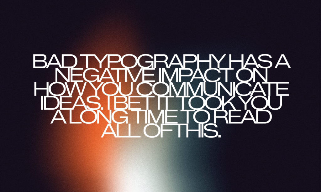
The text is too small. The lines feel cramped. Headings don’t clearly separate ideas. Important information gets buried in long blocks of copy. Nothing is technically broken, yet everything feels harder than it should.
This reaction happens almost instantly. Before users assess visuals or absorb meaning, they decide whether the experience feels manageable or demanding. That decision often determines whether they continue or leave.
The way text is presented on a screen, its scale, spacing, and hierarchy, plays a quiet but decisive role in how information is processed. It shapes attention, affects credibility, and influences whether people stay long enough to engage.
This is typography doing its work in the background.
It’s Not About Fonts
Typography is often mistaken for font choice. In reality, it’s about structuring information so it can be read with minimal effort.
Headings create orientation. Spacing establishes rhythm. Line length affects comprehension and comfort. Together, these elements determine whether content feels approachable or overwhelming. When they’re thoughtfully aligned, reading feels natural. When they’re not, even well-written content struggles to land.
This perspective aligns with long-standing usability thinking, including ideas popularized by the book Don’t Make Me Think written by Steve Krug, the notion that good design should remove obstacles rather than introduce them.
Strong typography doesn’t try to stand out. It succeeds by making reading feel straightforward and unforced.
The Structure Beneath the Surface
Behind every readable website is a structure that helps users understand where they are and what matters. This structure isn’t decorative, it’s functional.
Websites like Apple and Medium demonstrate how disciplined text systems support clarity at scale. Their pages remain familiar even as content changes. Hierarchy is consistent. Spacing is predictable. Reading feels steady rather than distracting.
Nothing competes unnecessarily for attention. Instead of forcing users to interpret the layout, the structure quietly guides them forward. Whether scanning product information or reading long-form content, the experience remains coherent across screens and contexts.
This sense of stability is intentional, the result of decisions made early and applied consistently.
Good Systems Prevent Bad Decisions
Many readability issues don’t come from poor content, but from the absence of a clear system.
Establishing typographic rules early, for hierarchy, spacing, contrast, and responsiveness, helps prevent inconsistencies later. Without that foundation, small deviations accumulate: uneven layouts, unclear emphasis, and patterns that break as content grows.
Early decisions also reduce technical friction. Font performance, accessibility, and responsiveness are easier to manage when they’re considered from the start rather than patched in later. A well-defined system allows a website to evolve without losing clarity.
Where Clarity, Identity, and Performance Meet
Typography affects more than how a page looks. It influences how users navigate, interact, and make decisions.
Buttons, menus, forms, and calls to action all depend on readable, well-structured text to function properly. When typographic choices are inconsistent or poorly considered, users hesitate. When they’re clear, interaction feels confident and natural.
At Plus972, typography is treated as a shared responsibility rather than a finishing detail. Designers and developers work together to ensure text systems are scalable, accessible, and aligned with the goals of each project. This approach supports both clarity and performance over time.
Typography rarely draws attention to itself. But when handled with care, it becomes the connective tissue between content, structure, and experience, shaping websites that feel intentional, trustworthy, and easy to use.