Minimalism has been around for way longer than people think. You’ll find it embedded in traditional Japanese design, particularly in the principles of Zen and Ma, which highlight the space between elements rather than the elements themselves. It talks about how elegance is built around restraint, clarity, and balance.
Later, in the 1920s and 30s, European movements like Bauhaus and De Stijl expanded minimalism into a formal design philosophy. They pushed for functionalism, systematic composition and the rejection of excess. Everything had a purpose, and visual clarity was seen as rational and progressive. For designers today working with brand systems, grids, and modular layouts, this sounds familiar.
Then, after WW2, minimalism became a global design language. The world had changed dramatically, and design had to respond to new realities, new markets, and new needs. For instance, resources were limited, so manufacturing had to be more efficient. Why waste steel on decorative curves when industries need to rebuild infrastructure? Why produce objects that were hard to manufacture when economies needed speed and scale? Design began to strip away anything that was not essential. Clean lines and simple forms became the new standard because they matched what was physically possible. The rise of ‘less is more’ made sense as it aligned with the practical and cultural conditions of the time. This was the moment minimalism stopped being an artistic experiment and became an international style.
The learning curve
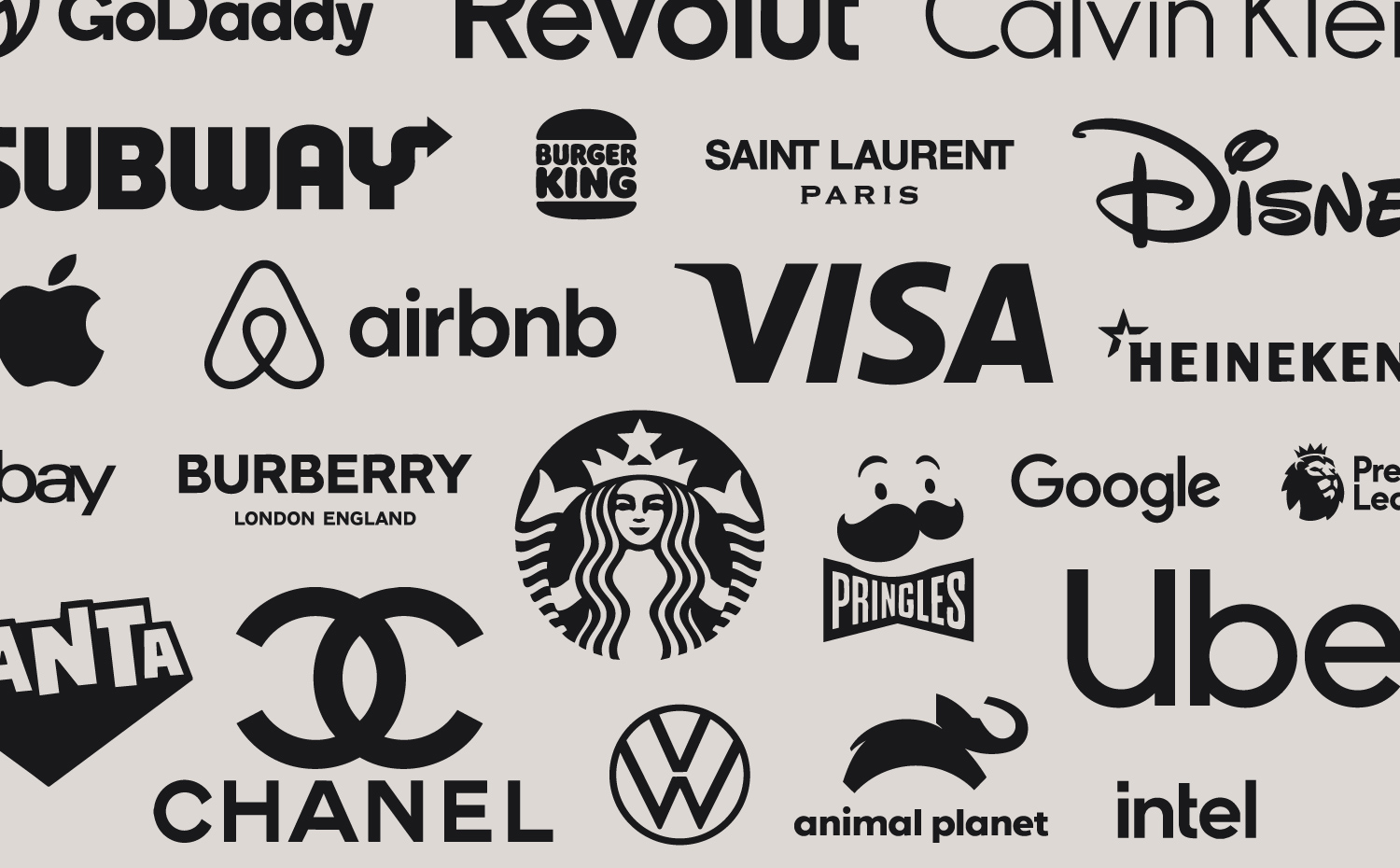
Minimalism’s early influence on branding was rooted in function. Corporate identities relied on bold, simple marks because they needed to be scalable, timeless, and easy to reproduce. These choices were driven by purpose rather than aesthetics.
The real acceleration came in the digital era. As UX thinking matured, designers understood that fewer elements supported faster comprehension and smoother interaction. Branding adapted to meet these expectations, evolving to work across apps, dashboards, and expanding digital ecosystems.
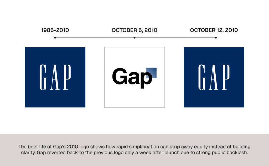
By the 2010s, minimalism had moved from a design principle to a mainstream trend, which exposed its limitations. Brands simplified logos not out of strategy but because everyone else was doing it. This led to companies losing distinctiveness in the pursuit of clean. Gap’s 2010 redesign became a cautionary tale here. The rebrand aimed for modern clarity but removed the familiar character that held decades of equity, showing how simplification without strategy can dilute identity.
This period is exactly what pushed the discipline toward its current evolution. Designers and strategists realised minimalism alone was not enough. It had to be directed, meaningful, and intelligent.
Transitioning to intelligent branding
Where older forms of minimalism often chased aesthetics, intelligent minimalism is built on decisions. It is not about stripping things away, but about refining until only the parts that create clarity, value and emotional connection remain. Several factors are accelerating this shift and they go beyond visual taste:
Information overload changed expectations
People are constantly exposed to screens, feeds and noises. Studies on processing fluency show that people trust visuals that are easier to interpret, as these are perceived as more credible and professional. This helps explain why minimalist interfaces often outperform visually busy ones. Intelligent minimalism leverages this psychology by making information easier to scan and decisions faster to make.
Global markets need systems
As brands operate across countries and channels, consistency becomes key. An identity full of decorations might look great on a poster, but it quickly collapses when teams need to execute it without designers watching over their shoulders. This is why intelligent minimalism thrives in complex environments. It provides frameworks, not assets. This makes it well suited for brands that want to scale without diluting identity.
Premium brands redefined sophistication
Complexity used to be a symbol of luxury. Today, luxury tends to signal itself through clarity, precision, and elegance. Think of high-end fashion, hospitality, wellness, and tech. They favor simple looks alongside strong storytelling and premium materials. Brands that position themselves in premium markets now rely on intelligent minimalism to project confidence. It communicates that the brand understands its essence and does not need visual clutter to make a point. Simplicity is harder to copy
Anyone can flatten a logo and call it a rebrand. Intelligent minimalism, on the other hand, is rooted in strategy. It is not the absence of style, but the presence of structure, which makes it far more defensible. When a brand applies minimalism in a way that is connected to behaviors, tone, motion, and interaction, competitors cannot just copy the look. They would have to copy the thinking.
What it looks like in practice
It is easier to understand intelligent minimalism when you look at how it appears in real branding. With typography, choices are more intentional and carry personality while staying clear across devices. Weight, spacing and rhythm do most of the work, which means type becomes a strategic voice rather than decoration.
Color follows the same logic. Instead of broad palettes or dramatic gradients, brands use a smaller set of hues where each color has a specific purpose. Accent colours guide the eye, neutrals create structure, and the final result feels curated instead of plain. Layout plays a similar role. Space is no longer treated as empty but as a navigational tool. It directs attention, supports hierarchy, and improves comprehension.
Motion design has also matured. It is no longer a place for designers to show off every possible transition. Intelligent minimalism treats motion as storytelling. Movement reinforces hierarchy, supports navigation, and adds personality through thoughtful timing. Imagery completes the system. Photography, illustration, and iconography are chosen to reinforce meaning, not to decorate. Every visual element has a job, and the goal is always the same: help the audience understand the brand faster and with less effort.
Why it works and where it’s going
Intelligent minimalism performs better because it aligns design with how people naturally process information. It makes communication sharper, builds trust, and supports digital behavior. It also adapts to cross-cultural markets and eliminates excess while keeping meaning. When a company presents itself with clarity and simplicity, it makes a conscious decision not to hide behind visual noise. This confidence is magnetic, especially in competitive markets.
What will continue to evolve is the intelligence behind it. Brands will invest more in things like design thinking, UX, and modular identities. AI will make production faster, which means strategy will matter even more. The brands that stand out will not be the ones that are simply clean. They will be the ones who understand the true purpose behind the simplicity.