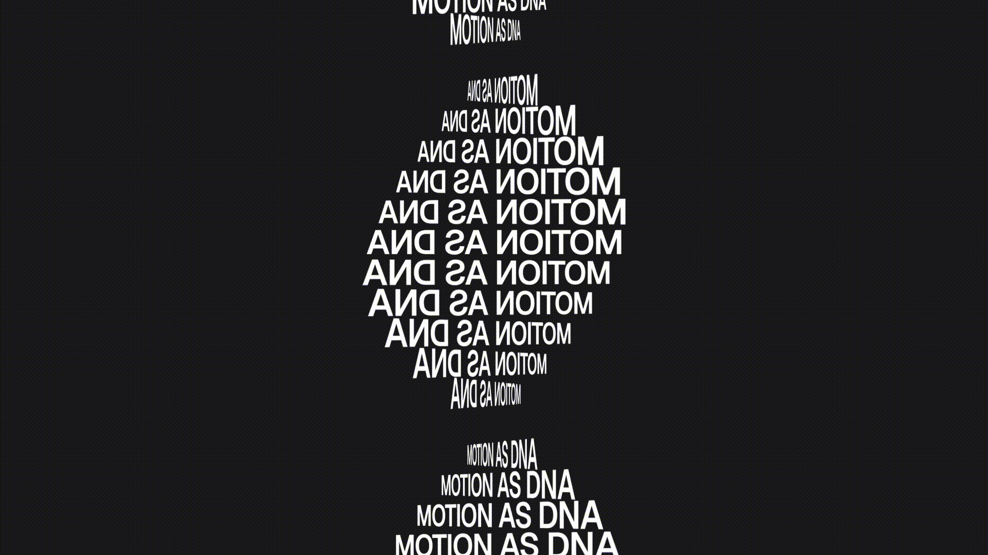
Quick Answer: Brand identity now hinges on motion as the key to connection. Brands that design how they move feel more human, consistent, and memorable.
Brand identity started as a survival mechanism. In the early 20th century, companies needed a way to stand out on crowded shelves and busy streets, so they stamped simple marks everywhere they could. Then, in the 1960s and 70s, modernists turned branding into a design system. Massimo Vignelli with the NY city transit authority graphics, Paul Rand with the IBM stripes, Dane & Blackburn with the NASA ‘worm’ logo: all born from an obsession with order and consistency. It was a revolution built for print, signage, and old-school TV.
This world no longer exists. Movement is no longer a detail, it’s now the medium. Brands today live on screens that scroll, swipe, and react. Recognition alone isn’t enough, connection is the goal. Motion design helps create that connection.
And sure, the big cinematic animations are fun, but the real power of motion sits in the micro-moments, the details people don’t consciously notice but instantly respond to.
Movement as a core principle
A luxury brand moves slowly, with grace and restraint. A tech brand might snap into place with precision. A lifestyle brand might be smooth, human, and a little playful. These rhythms define tone and attitude, and have become just as critical as choosing the right typeface.
When motion is missing, brands feel disconnected. Almost like a film with the sound turned off. Despite this, so many agencies are behind. Motion usually enters the conversation after everything else is done. The game is being played backwards…
When I design or direct creative work, I focus on behavior and appearance. How does this brand behave? What’s the pace, rhythm, and confidence level? When motion principles live next to typography, color, and layout in the brand system, everything starts to sync. You get a brand that feels alive and consistent, not because of the logo, but because of the way it behaves.
Some brands lead, most lag
Some brands already understand that motion is an integral part of their identity. Apple uses slow, confident animation curves that match its hardware philosophy. Airbnb builds warmth and humanity into gentle, organic movements. Duolingo uses expression, timing, and character animation to turn a simple app into a friendly global icon. For them, motion isn’t an add-on, it’s a strategy. But the truth is, most companies are nowhere near this level. And it is not because they don’t care about quality. It is usually for much simpler reasons.
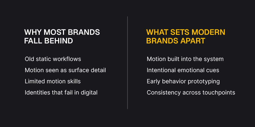
First, many companies still think in static because their internal processes were built in the print era. Identity projects are often shaped by primitive principles: logo first, visual system second, motion later if there is time or budget. They misinterpret motion as a production task towards the end rather than a strategic design decision.
Second, teams often underestimate how audiences respond to micro interactions. They assume motion is decorative when in reality it’s doing heavy emotional work. It guides attention, sets tone, and shapes the entire perception of the brand in milliseconds. Behavioral design is new territory, and changing mindsets takes time.
Third, plenty of creative agencies still lack the tools or talent to explore motion early. They don’t prototype, they don’t test behavior, and they don’t have someone advocating for motion at the strategy level. Without motion literacy, the work defaults to static by necessity, not by choice.
The result is predictable. Brands end up with beautiful identity systems that look great in a PDF but fall flat the moment they enter a real digital environment. The companies that lead the way today are the ones that broke out of that cycle. They recognized that motion is a design decision, and that shift in perspective is what sets them apart.
Why it matters now more than ever
Most brand interactions today happen in seconds. Swipe, tap, hover, scroll. These are small details, but they shape perception more than any billboard ever could. People don’t sit and analyse brand visuals anymore, they feel them as they move through digital space. Micro motion is where that feeling is built.
The flick of a cursor over a button, the way a menu reveals itself, the softness of a fade or the sharpness of a snap…These moments tell you everything about how a brand thinks. They’re small, fast, and subtle, yet they carry an enormous amount of emotional weight.
This is why motion is not just a craft skill. It’s a perception design. It’s decision-making in milliseconds. Brands that master micro motion feel more premium, more thoughtful, more cohesive, even if users can’t understand why.
The future of identity is kinetic
We’re designing for a world that moves, so our brands need to move with it. Not as decoration, but as expression. This is what makes motion the most exciting shift in identity design. It doesn’t replace the foundations of branding, it completes them.
This is exactly where we place our focus at Plus972. We approach identity work with the understanding that brands don’t just need a visual system, they need a behavioural one. Motion sits at the centre of that. Whether we’re building a brand from scratch or refreshing an existing one, we design for how it moves as much as how it looks. Because a brand that behaves with intention feels sharper, more consistent, and ultimately more memorable across every platform.
And if the past century of branding has taught us anything, it’s that the brands that adapt to the medium always lead the way.